


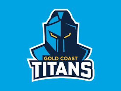
The Gold Coast Titans have revealed a new, cleaner looking logo as they look towards the 2022 NRL season.

I have to say, I like it!
I think the Titans were probably due a new logo and this one is simple and effective. It will look great on their jersey, their merchandise and all of their promotional material and yet it still look like their older logo in a lot of way.
Some times a new club logo can be a bit hit and miss, but this one does it for me!
What do you think?
We will be having a chat about the new logo on the next episode of Fergo and The Freak so make sure you subscribe!