


Wigan Rugby League club has change their logo and it must be said, the new one looks like absolute garbage!
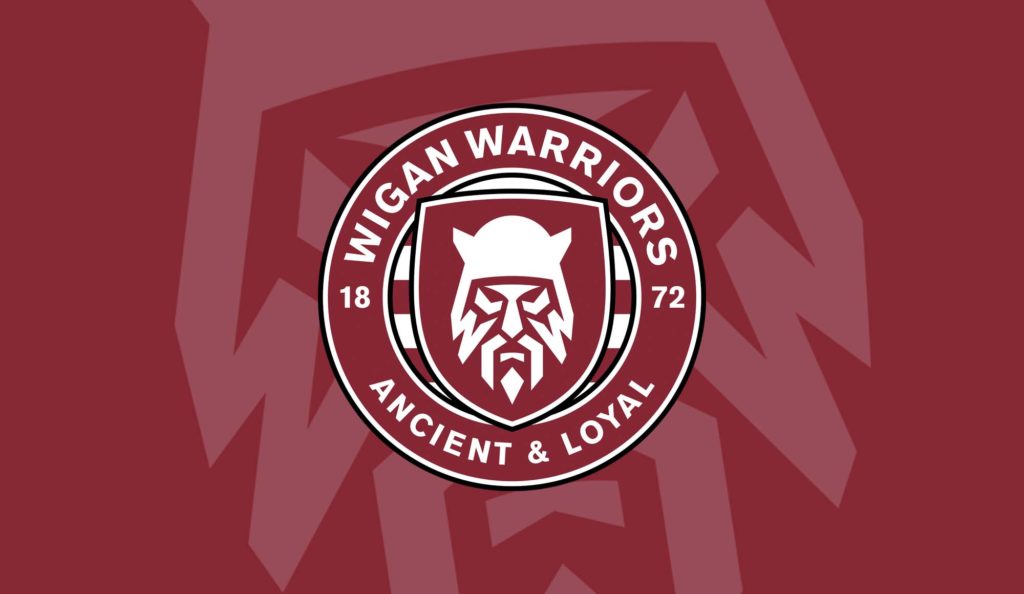
Its understood that the club was looking for a logo that was a little more simple than the clubs previous logo, and thats understandable. However the logo they have chosen not only looks second rate, but it reminds you of a cheap knockoff of a Widnes Vikings or Canberra Raiders logo.
Wigan fans are obviously pretty upset, with some fan made alternatives popping up on Twitter that actually look a lot better than the one above.
I tried 10 mins in photoshop and came up with this. pic.twitter.com/NIVVWaItJd
— Toby Stretch (@toby_stretch) November 1, 2020
The thing that I find a bit strange is that new few people in the game actually call Wigans Rugby League club the “Wigan Warriors”. They are just Wigan.
I ran a poll on my Twitter to ask people about this. Have a look at the results.
Do you know ANYONE that calls Wigan’s Rugby League club the “Warriors”?#RFL #SuperLeague #IntRL #Rugby #BBCRugby #RugbyLeague #NRL
— League Freak (@LeagueFreak) November 1, 2020